Colour Schemes for Text-Based Games
December 5, 2015 | View Comments | |I’ve been working on a strategy game which will rely heavily (but not exclusively) on text. Now, text is not the most appealing thing to look at, so the UI (user-interface) will need some thought.
In this post, I look at potential colour schemes. The UI will only really need 1 colour for text, and 2 colours for the background. I’m going to take inspiration from how Ethan Schoonover’s Solarized uses complementary colours for foreground and background to increase contrast (and hence visibility) of text.
The game will have a medieval/fantasy theme, so I’ll go with a brown background and blue text. All that remains is to decide on brightness.
In this image, I take background and foreground colours at regular brightness intervals, and compare the result.
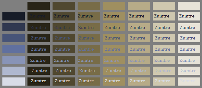
Comparison of background and foreground combinations
This narrows down the choices considerably. Next, I look at using lighter or darker backgrounds. Some quick research suggests that neither is considered necessarily easier on the eyes than the other. It is suggested that content, the user’s main focus, should be highlighted with a lighter background, which I think is confirmed below.
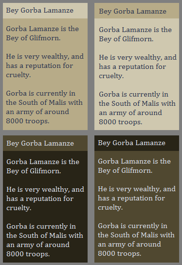
Comparison of light and dark colour schemes
I find the lighter colour schemes easier to look at, an eventually narrow the choices down to the following:
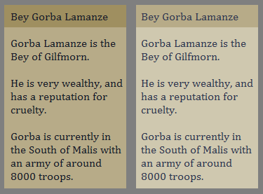
Comparison of light colour schemes
The scheme on the left is more striking, but I’m leaning towards the one on the right, which is gentler.
comments powered by Disqus